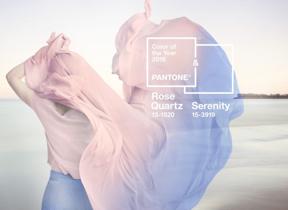
In a world first, Pantone has chosen the blending of two shades as the colour of the year. While this blend is unnamed, both Rose Quartz and Serenity are lovely pastel colours that evoke stunning imagery of calming beauty. We take a look at the history and meaning of these two colours today.
According to Pantone, Pantone 13-1520 TCX (Rose Quartz) and Pantone 14-3919-TCX (Serenity) (also known as pastel pink and blue), represent our increased comfort with using colour as a form of expression.
Full statement:
“Globally, we are experiencing gender blur as it relates to fashion, which has in turn impacted color trends throughout all other areas of design. This more unilateral approach to color is coinciding with societal movements toward gender equality and fluidity, the consumers’ increased comfort with using color as a form of expression, and an open exchange of digital information that has opened our eyes to different approaches to color usage that challenge traditional color associations.”
The parallels of gender equality and acceptance are only too obvious, seeing as both of these colours carry so much history. We’ve also seen people link this to transgender acceptance, seeing as the transgender pride flag itself uses very similar colours. But there’s something we haven’t really seen mentioned much, and that’s the history of pink and blue.
Let’s take a trip back a few hundred years, before the 20th century. Boys and girls wore dresses until they were around 6 or 7, this is also the time that boys would receive their first haircut. There’s a picture of Franklin Delano Roosevelt at the age of 2 and a half, wearing a white dress with long hair, which we’ve kindly linked with thanks to the Smithsonian. While we’d look askance at this today, a parent from 1884 would hardly give a second glance.
Colour burst onto the scene around the time of the Great War. But contrary to what you’d think, it was pink that was the masculine colour, and blue the feminine. According to a 1918 trade publication, “The generally accepted rule is pink for the boys, and blue for the girls. The reason is that pink, being a more decided and stronger color, is more suitable for the boy, while blue, which is more delicate and dainty, is prettier for the girl.”
Baby Bobby, a toy and it’s clothesIt wasn’t until the 1940’s that people finally settled on the meanings we know today for blue and pink. The baby boomers grew up with the stereotypical gender-specific clothing that we know today – boys dressed like their fathers, girls like their mothers.
Then came the ’60s, along with the womens’ liberation movement and active feminism. The stereotypes were rejected in favour of masculine clothes for girls, or at the very least un-gendered clothing. This persisted until the 1980’s, with gender neutral clothing for both boys and girls.
And so we have today, as we move forward towards more peaceful and accepting times. Some say Pantone should stay out of politics, others laud Pantone for taking a stand.
I personally think the mixture of colours looks amazing and we’re looking forward to seeing new living rooms with these styles. Also, everybody love everybody, costs you nothing. To a happier new year!
Leave a comment on this post
Read more on sofa guides


Behind the seams
Why replace when you can refresh?
Our sofa covers give your sofa a brand-new look without the cost or hassle of buying new.
Find your perfect couch cover