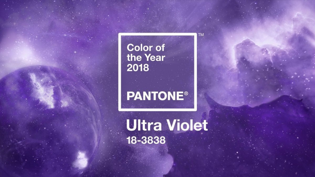
Pantone has officially announced their pick for Pantone’s Colour of the Year 2018: Ultra Violet. This vibrant, complex and provocative colour often alludes to the mysteries of the cosmos.
Symbolising the vastness of our Milky Way skies and the possibilities that inspire us to search our individuality – quite a difference from last year’s bright, leafy Greenery colour.
Purple has long been associated with being unconventional, counterculture and artistic. Pop culture icons such as Prince, David Bowie and Jimi Hendrix paraded shades of Ultra Violet as a mark of their individuality and non-conformity. Probably explains why it’s called “Ultra Violet” instead of “Ultraviolet”.
Laurie Pressman, vice-president of the Pantone Colour Institute, said: “The Pantone colour of the year has come to mean so much more than ‘what’s trending’ in the world of design; it’s truly a reflection of what’s needed in our world today.
“From exploring new technologies and the greater galaxy, to artistic expression and spiritual reflection, intuitive ultraviolet lights the way to what is yet to come.”
Using Ultra Violet in your home
Now here comes the all too important question: “How do I incorporate it into my home décor?” Ultra Violet is a complex colour that can be intimidating and difficult to style with. At times the colour can be a statement and other times it can overbearing. Don’t fret as there are still ways you can incorporate the colour into your house.
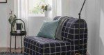
Use The Colour as Accent Pieces
Keeping this purple as small pops of colour in a living space will keep the space fun and lively without you feeling overwhelmed.
Throw a few Ultra Violet pillows on your sofa or Bohemian styled rug with hints of purple in it. These are the perfect baby steps for starting to decorate with this statement colour.
Combine with Pinks, Blues and Purples
This style option might be for the little braver self-proclaimed ‘interior designer’. Adding dashes of different pinks, blues and purples can soften the striking Ultra Violet without taking away from its vibrancy.
Combining these will make any living space feel artistic and creative.
Our Verdict?
It’s very safe to say that Pantone does not simply choose a random colour every year. The Pantone Colour Institute studies the trends of designers, artist and brands to make their decision.
In my opinion, Pantone’s choice for colour of the year reflects on an individual’s creativity and imagination. You can make a statement and add the colour in your home, your wardrobe or even your hair!
Needless to say though, it really comes down to whether you like the colour to begin with to really use it.
What do you think? Gaudy? Impractical? Let us know, right below!
Leave a comment on this post
Read more on sofa guides


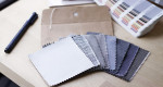
Behind the seams
Why replace when you can refresh?
Our sofa covers give your sofa a brand-new look without the cost or hassle of buying new.
Find your perfect couch cover