Have you ever loved someone’s living space so much that it inspires you to revamp your own? In this post, we’ve got several beautiful IKEA spaces that will definitely inspire you in your next home makeover.
IKEA furniture are affordable, stylish, and easily customisable with various IKEA hacks. The only gripe most people would have about them is the assembly process—but even some seasoned IKEA buyers find the process therapeutic.
To further prove how simple IKEA furniture can complement any space in your home and make it look amazing, here are some gorgeous spaces that utilise IKEA furniture.
They’re seriously #homegoals, serving as inspiration for the home that we can definitely achieve.
The room makeover that cost less than $600 pull off
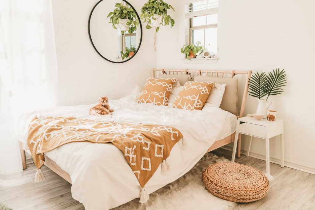
Jane, the blogger behind A Taste of Koko decided to breathe new life to her house’s guest bedroom earlier this year, and gave it a lovely earthy-toned makeover with various IKEA furniture that only came up to less than US$600! What a steal.
Watch how she carefully curates the colour palette in the items that she picked, ensuring that they complement each other harmoniously.
She starts off with the biggest piece of furniture, the IKEA Bjorksnas bed frame—then works her way around smaller pieces that will complement the look of the bed.
“I wanted the bedroom to have a white theme with minimal pieces and then add colourful accent pieces,” Jane writes in her blog.
Other pieces from IKEA that she included in her overall room makeover were the Selje nightstand, Vivan curtains, Boja pendant lamp, Alseda stool, and more.
A chic update in the dining area
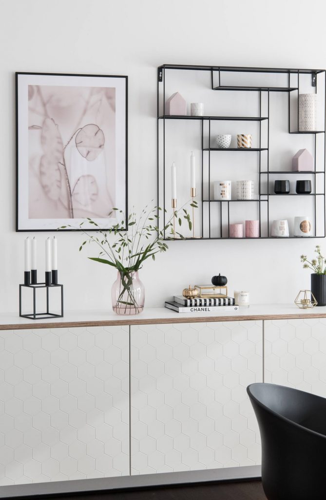
The beauty of IKEA furniture lies in its customisability.
Sori of Sori Writes showcases the IKEA Besta cabinets in Vassviken, a chic white option with hexagonal debossed prints on the doors.
Instead of affixing the legs, she has chosen to go with a floating cabinet style in her dining area.
It truly is a versatile and minimalist piece of furniture that can be used anywhere in the house.
The IKEA Docksta, a prevailing dining table
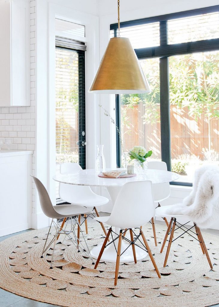
Round pedestal tables are one of the most classical designs for a dining table, and the people behind Coco Kelley know it.
It’s the perfect size for smaller houses and makes the space look great too.
In one of their compilations between a high and low comparison of round dining tables, naturally, IKEA had to be a part of it.
The IKEA Docksta table is one of the more prevailing dining table designs in the store, and its style is timeless enough to look good throughout the years.
The IKEA rug that doesn’t need to be on the floor
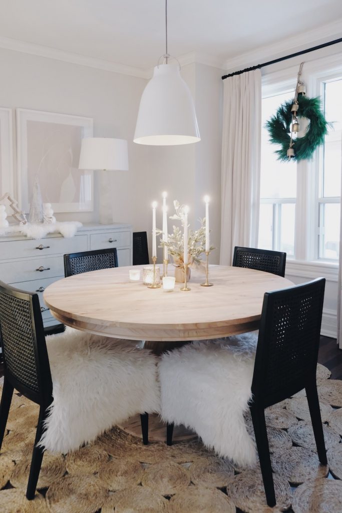
Can’t help but run your hands over the IKEA Ludde sheepskin rug each time you pass it in the store? We’re guilty of that too. The wool is so fluffy to the touch that it feels inviting to our hands, what more our feet?
But like most IKEA products, there is more than one way to use it—all you need is your creativity.
Jacqueline Clark of Lark & Linen uses the rugs as a decorative throw on her dining area chairs, giving it a warm and wintry look for the festive season.
If the fluff is too much for you, our Brushed Cotton dining chair slipcovers may be a better option. Its soft and smooth texture offers a luxurious aura to the dining room effortlessly. If that still doesn’t satisfy you, choose from a wide range of fabrics and elegant colours to redecorate your dining room.
A stunning monochromatic living room
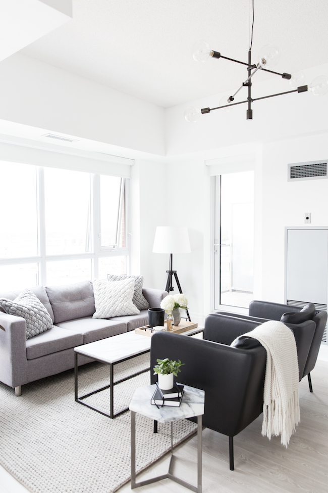
Jacqueline Clark from Lark & Linen lends her magic touch to a couple’s new home, using a largely monochromatic palette and playing around with layers and textures.
These design points were obvious in the living room, where Clark matched the IKEA Ekero armchairs and IKEA Lauters floor lamp—both in black—with lighter colours and textures in fabric.
The resulting look is altogether clean, fresh, and modern. The textures add on a hint of cosiness to the otherwise more streamlined monochromatic look.
Looking to elevate your living room with a more modern, monochromatic design? One easy way to do it is to slipcover your sofas with black or white fabrics, such as our Cotton Canvas Black and Brushed Cotton White.
One of IKEA’s iconic locker cabinets is a bedroom essential
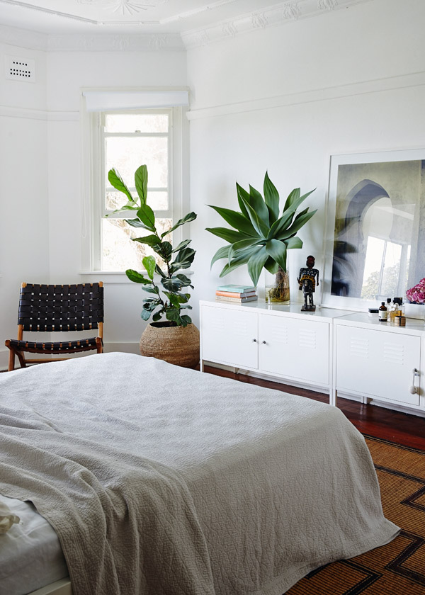
The beauty of IKEA products is that you don’t necessarily have to use its furniture exactly for what it’s intended. Take the IKEA PS cabinet, for example.
Some use it as a TV console, while others might use it as a bedside table between two beds.
You can use just one cabinet or merge two beside each other and elongate the look, similar to what we saw on The Design Files.
Cassandra Karinsky did it in her one-bedroom home in Sydney. Thanks to the minimalist white look of the IKEA PS cabinet, she was able to style around it, adding ethnic pieces without crowding the look. Take a look at this article here for more minimalist living room ideas.
The IKEA Soderhamn is given an update
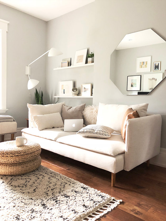
For most of us, our IKEA sofas follow us throughout our homeownership journey. From our first purchase at a rental home to our modest new home later on.
However, wear and tear may make our sofas look shabby. Thank goodness for slipcovers that breathe new life into them!
In fact, Jo of Neat n Tiny did just that.
She customised a Comfort Works sofa cover for her IKEA Soderhamn sofa, picking our linen covers.
“To give our tiny home a lighter, loftier feel, I stick to white and neutral hues. I also shy away from bold shades on large, staple pieces and prefer a judicious sprinkling of colour with throw pillows and other accents,” she writes on her blog.
With sofa slipcovers, you can achieve the minimalist look easily without having to break the bank, or anything in your house, in this case.


