The web is a major source of inspiration and there’s nothing more I like to do in our down time (well, aside from eating ice cream, watching TV, shopping, etc) than stalking DIY and decor bloggers online and obsessing over their amazing living spaces. What’s more captivating, is their keen sense of aesthetics using IKEA products – would definitely advise to have your Pinterest extension ready if you haven’t.
I’ve managed to narrow down my top five favourites below:
Liz Marie Blog
Liz Marie’s super cool living room is anchored by her lovely IKEA Ektorp sofas and done in a neutral palette. Piled with throw pillows and a woven carpet underfoot, it looks like the perfect recipe for a lazy afternoon with a good book. Liz Marie is an interior designer and antique collector; and I love how her living room encapsulates her interests in a nutshell. More pictures with a detailed breakdown of the pros and cons of her IKEA Ektorp sofas can be found on her blog.

Retreat
There’s an elegant simplicity to photographer Emma Gutteridge’s hacked IKEA Karlstad 2 seater. She says her living room is small and it’s difficult to get far back enough to take a good picture, but you’d never guess that! Emma’s blog is mostly focused on wholesome, simple living and sustainable home products, and this aesthetic is represented clearly in her living space.
Just look at the sofa legs and tufted cushions, who would even guess that it’d be IKEA? A light-filled room, a cup of warm tea – you can feel it already, can’t you?
Emma’s style is mid-century modern and skandi-chic.Veronika’s Blushing
The pictures below presents a strong case for a living room with high ceilings – look at how the long IKEA Ritva curtains balance out the low, horizontal lines of the couch! Veronika blogs mostly about fashion, beauty and style with an enviably beautiful home to boot! Her open plan living room looks both luxurious and cosy and I’m also loving the IKEA Latt table in the kids’ corner.
Light, airy linen curtains complement the lush velvet textures of the rest of the room. A living room isn’t just for adults – check out the kids’ corner!
The Makerista
But wait… are those Billy bookshelves? I didn’t believe it until I saw pictures of the project in progress. Gwen is a stay-at-home mom-slash-DIY blogger extraordinaire who took on the project of revamping her friend’s living room and she did a phenomenal job. The challenge was to maintain the historical aspect of the home while adding a more modern character to the living area.
It’s especially wonderful how a traditionally budget-friendly item like the Billy can be used to lend a contemporary feel to the room and the library ladder lends an rustic element to the otherwise elegant, bold elements in the rest of the living room. Check out how it was done over at Makerista.
DIY meets classic elegance in this remodelled historical home.
Lovelies In My Life
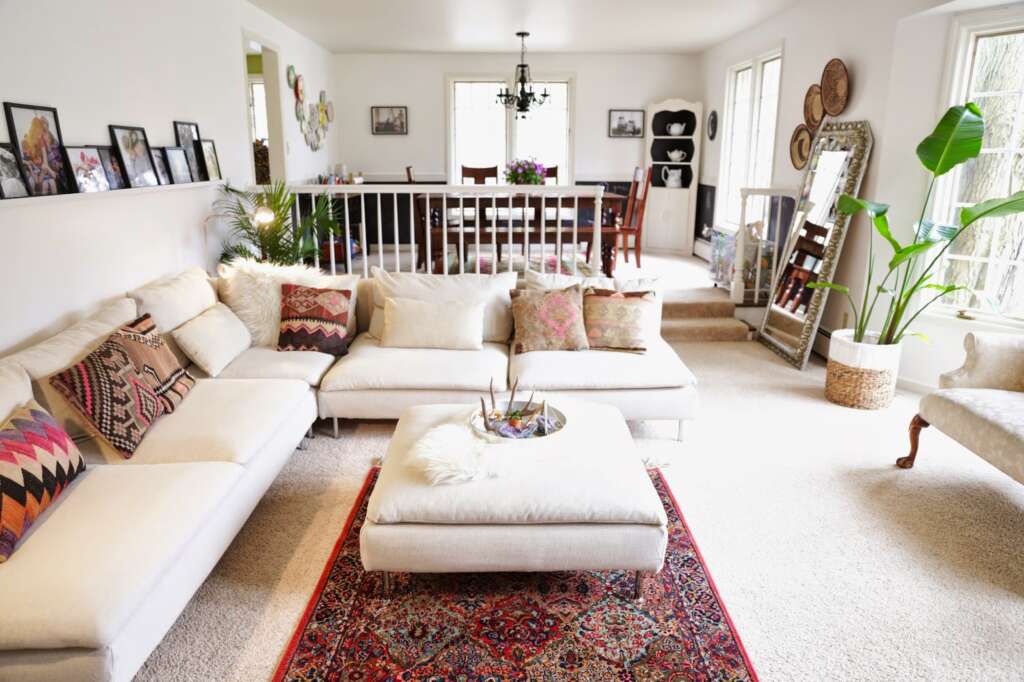
Recently, Kirsty transformed her Soderhamn sectional with a new slipcover and the results are spectacular. I’m loving the wonderful openness of the space and how the colour theme ties together so nicely. It’s just the perfect, cosy family room.

That sums up my current obsessions in a neat little package for living room inspiration. Do you know any other super amazing Ikea living rooms from around the Internet? Share it with us in the comment section below!


Emma Gutteridge
Oct 4, 2015Thanks so much for featuring my post, there’s since been the addition of a puppy so it’s not looking quite so neat now ;)
Chuck
Oct 5, 2015No problem Emma,
Good things should always be shared we feel :)