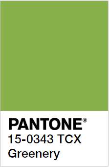
A year after breaking the rules with Rose Quartz and Serenity, Pantone have settled for a more traditional single colour this year. Introducing:
PANTONE 15-0343 TCX GREENERY
Color values:
RGB: 136 176 75
HEX/HTML: 88B04B
And as we all know, Pantone chooses their colours for a reason. One of which they’ll be more than happy to inform us of in the following quote:
“Greenery bursts forth in 2017 to provide us with the reassurance we yearn for amid a tumultuous social and political environment. Satisfying our growing desire to rejuvenate and revitalize, Greenery symbolizes the reconnection we seek with nature, one another and a larger purpose”
– Leatrice Eiseman, Executive Director of the Pantone Colour Institute
Greenery is a fresh and zesty yellow-green shade that evokes the first days of spring when nature’s greens revive, restore and renew. Illustrative of flourishing foliage and the lushness of the great outdoors, the fortifying attributes of Greenery signals consumers to take a deep breath, oxygenate and reinvigorate.
What is the PANTONE Color of the Year?
A symbolic color selection; a color snapshot of what we see taking place in our global culture that serves as an expression of a mood and an attitude.
A rather apt statement, considering the travails we’ve gone through in 2016, both politically and ecologically. Pantone is clearly hoping for a better 2017.
Greenery has actually been popping up all over the summer/spring fashion shows in 2016, so we wouldn’t be surprised to see plenty of great fashion pieces featuring these colours this year.
Gucci Spring/Summer 2017 showPantone also has a neat colour palette showing off how you could pair this neutral green shade, check it out here.
But what about Decor?
Well, this green is an energetic colour that’s better suited for a room where there’s activity rather than a room meant for relaxing or sleeping. You’ll have to really get a feel for your room and define what you want it to be.
Look for ways to coordinate. From the floor to furnishings, what other colours are in the room? Use Greenery to add interest and grab attention, especially if you have neutral furniture. It works nicely with whites, beiges, and grays. For a retro vibe, pair it with orange; one is warm, the other cool.
Think about the lighting. For a room that doesn’t get much light, this shade of green adds energy. Otherwise, keep in mind that the natural light changes throughout the day in a room, and the light cast by bulbs affects how you’ll perceive colour. So paint large test patches on your walls, and look at them at different times of the day.
For inspiration, we’ve added some of our favourite decor shots from Houzz below, click the link to get more info about how they did it!
Something that people tend to miss, is that Pantone doesn’t decide or pick a colour of the year randomly. The reason why so many products are so easily marketable after a colour of the year announcement is that Pantone is merely selecting something from the fashion gestalt.
The process, which takes about nine months, is highly subjective, as Pantone admits, and more about instinct than science. Essentially, the team fans out across the globe and explores industries, to collect what they refer to as “proof points” — from car shows, on the runways, in decorator showcases and so on. At a certain stage they begin to notice meaningful overlap and narrow down the choices. Then one shade achieves critical mass.
In closing, here’s my thoughts on everything that’s happened in 2016, and what we have to look forward to in 2017, from our Pantone Colour of the Year Mascot.
It ain’t easy being greenery